Interview - Simon Bronson, Mograph Designer
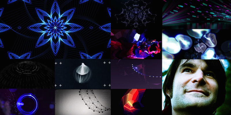
Simon Bronson is a talented Motion Graphics Designer, who is currently the Head of Design at Method Studios in Melbourne, Australia. I have had the pleasure of knowing Simon personally for a few years and he has been involved in the development and testing of many of our products. In fact, his early experiments using Plexus are still featured in our gallery. I had the opportunity to talk to him about his work and design in general.
Please explain a bit about yourself and your background.
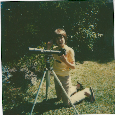
I grew up in the 70s, with hippy parents who were very encouraging of me expressing my creativity. I discovered photography as a teenager and converted our bathroom into a darkroom when everyone went to bed. Being able to create an image from a boring negative is very satisfying.
Photography is the foundation of what I do now, even if its an abstract thing created within an all computer enviroment. Experimenting with lenses, knowing what works compositionally, how light is interpreted through a camera is all essential stuff for animation.
How did you end up doing Motion Graphics?
I was editing corporate videos and film clips many many years ago, I also worked onset as a camera assistant and sound recordist before that. I tried my hand at directing live action but it was way too stressful for me at the time.
After editing for a few years I became more and more interested in creating vfx for friends film clips. After I started playing with photoshop, a friend gave me a 10 minute introduction to After Effects. This was pre 3D layers, you had to use a tool called 'motion math' to calculate parallax. It was so nerdy and awesome.
Before there were any tutorials on the internet, the only way to learn more to move forward was to work at a studio. I moved to sydney to get a mentorship at a broadcast design house, zspace.
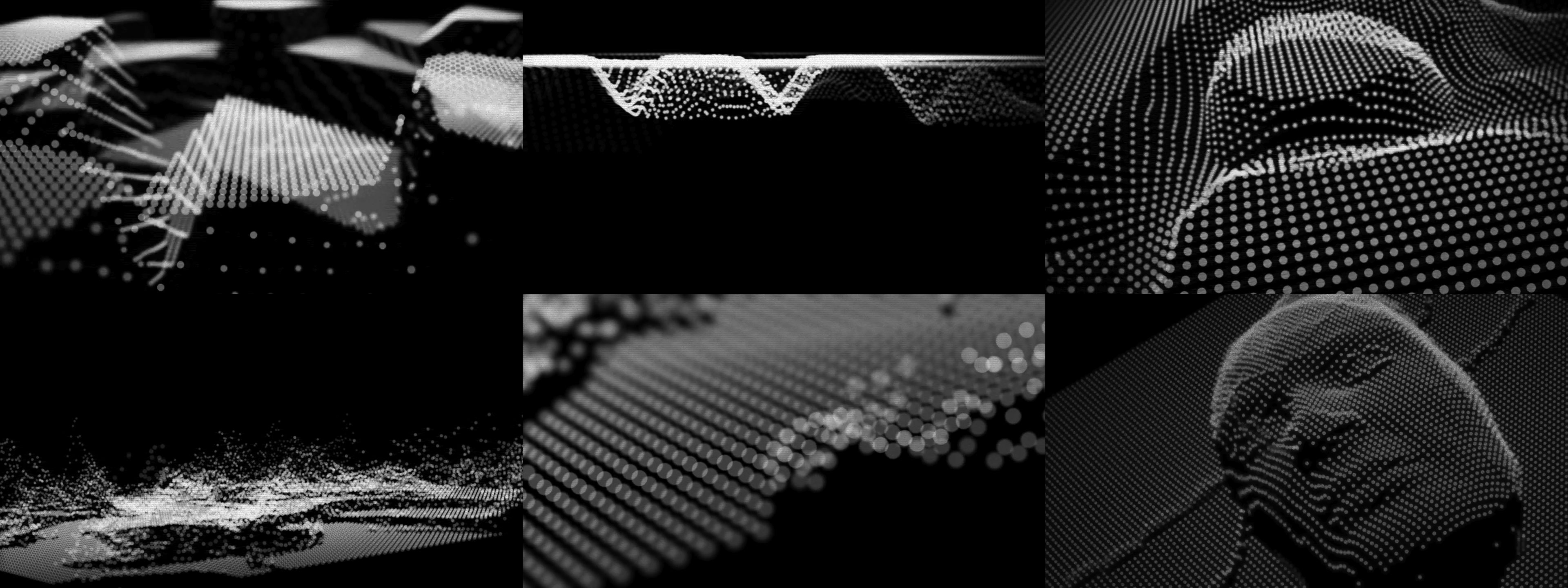
After this I got a job at an advertising agency as a editor/designer, then in 2005, I moved to London to freelance. In between proper paying jobs I got hooked on Trapcode Form which was an After Effects plug-in that really allowed me to geek out. The first thing I made with it got a bit of attention which was encouraging.
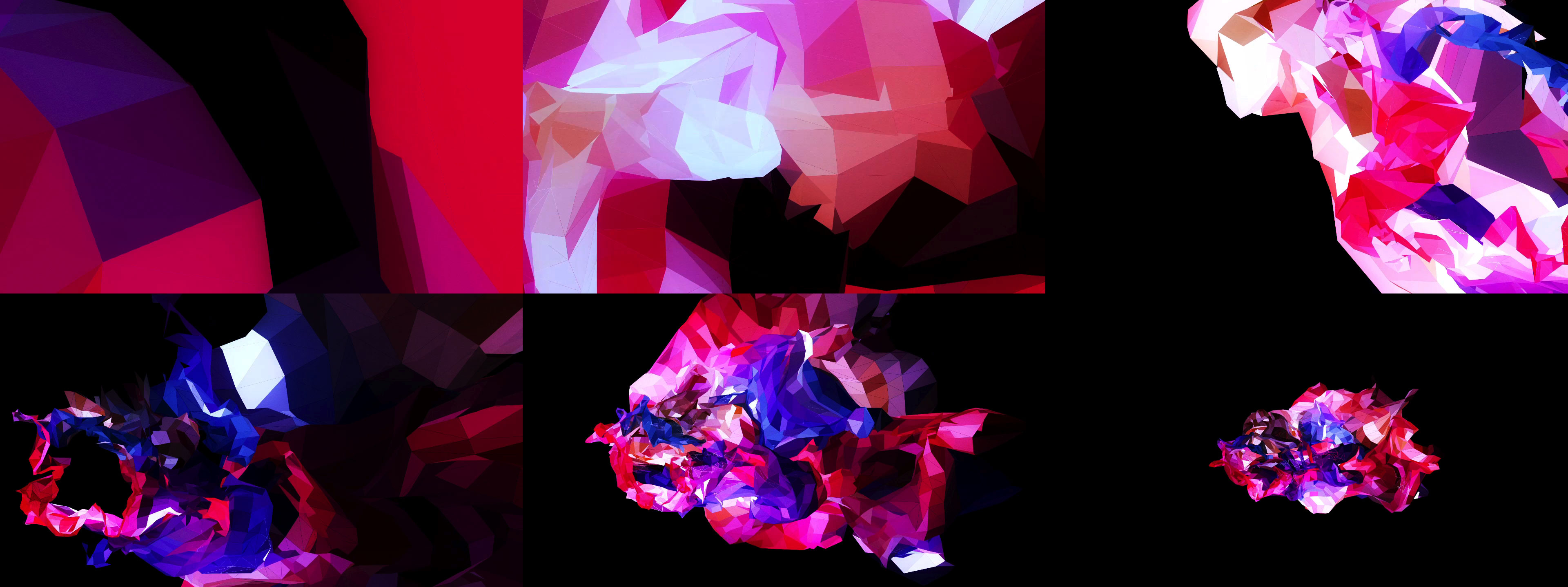
A few years later I started beta testing Plexus which appealed to me with equal parts creative and technical satisfaction. Both of these plugins were so much fun to experiment with; without a goal in mind, I kept producing short videos that were so much more creatively satisfying than having to sell anything in particular.
You seem very adept at utilizing sound to enhance your videos. Can you explain a bit about your process?
Along with photography, in my 20s I toyed with guitars and keyboards in my bedroom. Although technically I wasn't very proficient at either instrument it didn't stop me layering sound on a 2nd hand 4-track tape recorder. I suppose I'm a frustrated musician/photographer/film maker who gets to channel it through motion design.
I've tried some audio reactive experiments but I find the direct translation of audio volume to keyframe data too prescriptive. There are exceptions to this, I love Sonar by Renaud Hallee.
Process wise, I generally animate first then put on my sound designer hat afterwards.
There are so many great resources such as http://www.freesound.org/ , http://freemusicarchive.org/ and http://ccmixter.org/ that I use regularly.
I also like the artists on http://www.helaudio.org/ that have many great acts, such as ok ikumi.
Once I have my render I scour these sites to find a track as the basic mood, and use fcp or premiere to lay up my edit.
I'll shift it around trying to find the right time to come into the track and then work out the back end, usually by stitching together a natural end to the piece. Then it'll be cutting up pieces of the track to hit certain beats of the animation or cutting my renders up to fit the music. Sometimes I'll have a base sound effect to add some more dimension, such as some sort of atmosphere recording.
Explain a bit about your commercial work and your typical design workflow.
We get briefs from advertising agency and our job can be from simple execution to strategising an approach. This usually involves a few different ideas conveyed through style frames. Once a direction has been chosen we make animatics. Depending on the project it could involve just one designer or the whole team.
Budget will most likely determine the amount of time you have to execute a job. We'll often use projects to try new techniques that we've been testing in our downtime. Also there's nothing like a tight deadline to get you thinking on your feet and finding creative solutions compared to personal projects that can drag on forever.
What are the current design trends in MoGraph that get you very excited? What trends do you not like?
The easier things have been to make something means that often work can get a bit preset-y. Cinema 4D being the tool of choice these days has had people making lots of shiny cubes moving around with effectors. For a while everything was drawing lines and when Trapcode shine was released in the 2000s everything had god rays on it.
There has been a growing backlash against 3D stuff for a while which is refreshing. It may have run its course by the time you read this, but I do marvel at Buck's illustrated work such as Good Books - Metamorphosis that has set the trend for illustration in design for the last few years.
Where do you get your inspiration from?
I take inspiration from many talented designers like fellow Melbournian, Cameron Gough. His company Dirty Puppet does great character animation. Award winner, Patrick Clair who is working over at Antibody
Daniel Crooks, artist, makes some amazing time sliced pieces.
Also my old work colleague Ben Alpass who's just relocated to LA is always inspiring too. Talented illustrators and Gif makers such as Markus Magnusson and slick key framers such as Sander van Dijk. Basically people who do awesome stuff that I can't do.
In your view, what is the most challenging aspect in motion design?
Like any creative discipline, its trying to find your own voice and not to repeat what everyone else is doing. Also to keep the momentum up and output something before you hate it. This is why most of my pieces are short, I finish them before I hate them.
Your advice for future motion graphics designers?
Start photographing, drawing or whatever medium you connect with, they will all feed into your work on the computer. I believe in computer doodling. I try to spend time just mucking around without any goal in mind and see where it takes you. Collaborations can be very fruitful, bouncing ideas off other people not only lifts the work but you'll probably learn a lot in the process.
You can reach Simon directly at http://www.simonbronson.com/ or follow him on Twitter.

